fonts
About
Custom Fonts
Licensing
Cart
Contact
Fonts
About
Custom Fonts
Licensing
Contact
Cart
Uniquely modern typefaces made for visually memorable storytelling and brand design.
Active Font Family
Bakerie Font Family
Botany Font Family
Braisetto Font Family
Cheddar Gothic Font Family
Citrus Gothic Font Family
Config Font Family
Config Mono Font Family
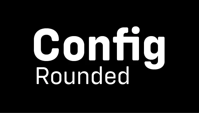
Config Rounded Font Family
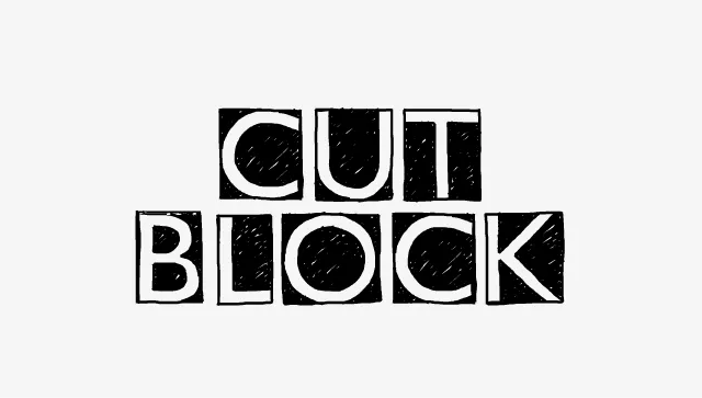
Cut Block Font Family
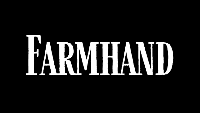
Farmhand Font Family
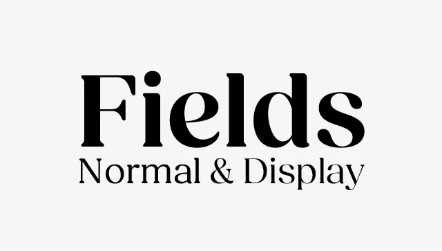
Fields Font Family
Fractul Font Family
Fromage Font Family
Garlic Salt Font Family
Gopher Font Family
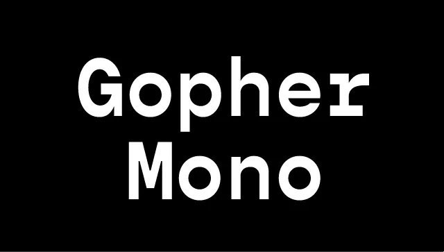
Gopher Mono Font Family
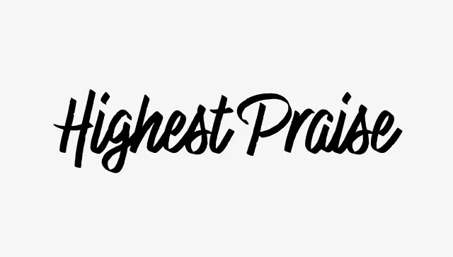
Highest Praise Font
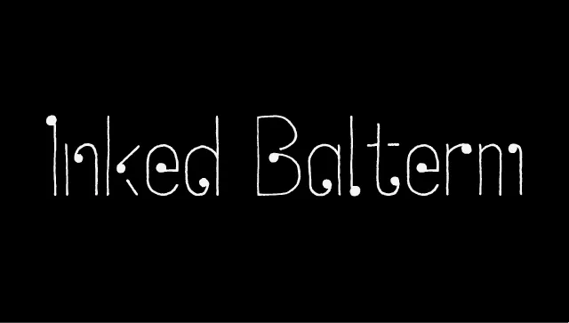
Inked Balterm Font Family
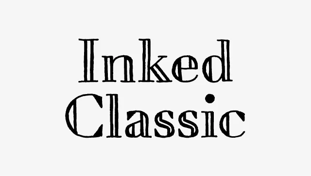
Inked Classic Font Family
Konnect Font Family
Likely Font Family
Lufga Font Family
Magdelin Font Family
Neato Serif Font Family
Neulis Font Family
Oilvare Font Family
Otterco Font Family
Poster Cut Neue Font Family
Quiche Flare Font Family
Quiche Font Family
Quiche Sans Font Family
Seabass Font Family
Serca Font Family
Skie Font Family
Tape Back Font Family
Trailmade Font Family
Zuume Edge Font Family
Zuume Font Family
Zuume Rough Font Family
Zuume Soft Font Family
HOW Magazine Redesign
Logos
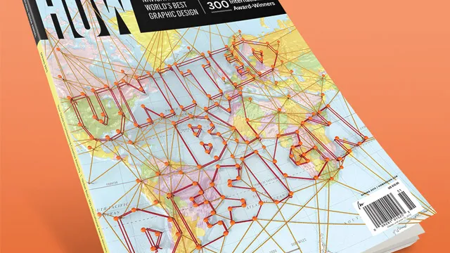
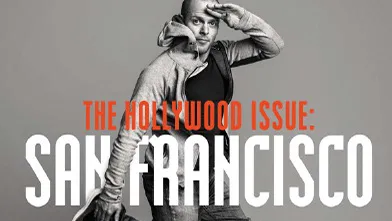
HOW + PRINT Magazine Covers
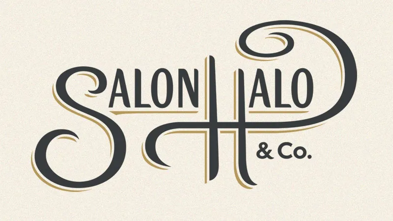
Salon Halo Logo
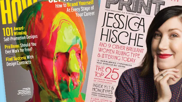
HOW + PRINT Magazine Features
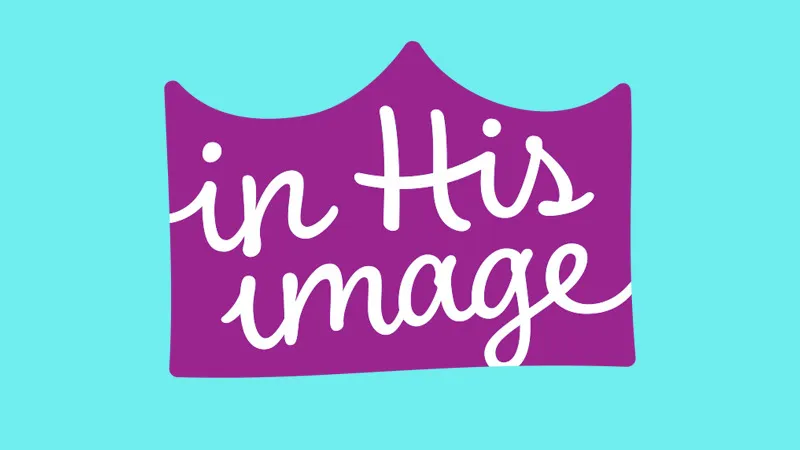
In His Image Dolls Logo
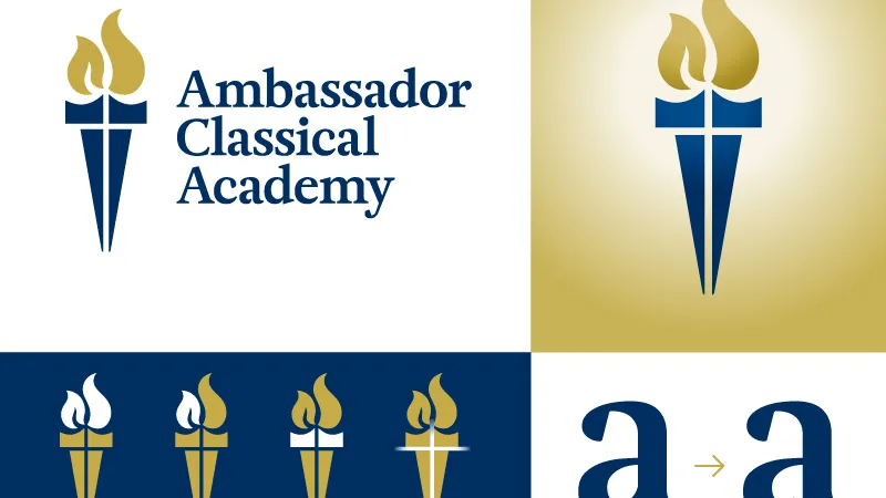
Ambassador Classical Academy Logo
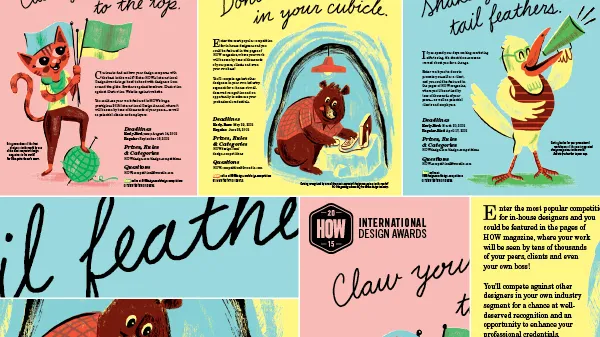
HOW Design Competitions
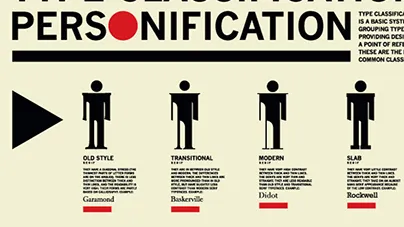
Type Classification Personification
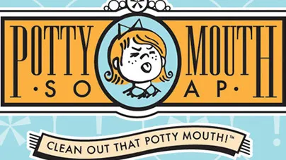
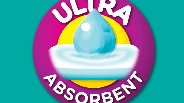
Potty Mouth Soap Logo
Staten Island Arts Branding
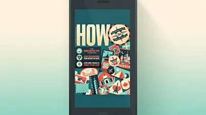
HOW iPad + iPhone
Packaging Graphics
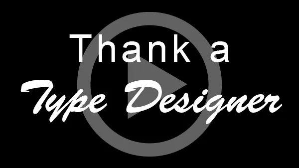
Thank a Type Designer
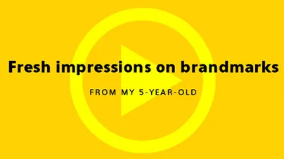
Fresh Impressions on Brandmarks (from my 5-year-old)