
Staten Island Arts primary aim is to empower artists and build
community. They do this through multiple programs and events to
help support artists and advocate on their behalf. Additionally,
they seek to engage the community (from children to seniors) in
the arts, be it painting, dance, music, new media, etc.
Established in 1992, they moved in 2012 into a new, highly visible
space at the St. George Staten Island Ferry Terminal that would
create more exposure. This was a great time to rebrand.
Operating under the acronym COAHSI (Council on the Arts and
Humanities for Staten Island), they sought a new logo, simplified
name, and visual identity system to usher them into their new
space and era, and unite their operational divisions. Their
criteria was that the design be memorable, lively, and highly
functional in 1-color.
The logo depicts SIA as the "hub" of activity with rays emanating into and out of it. An "S" shape is used for the rays to tie it to the name, and the color palette reflects the Staten Island Ferry.
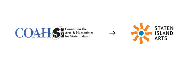
Before and after.
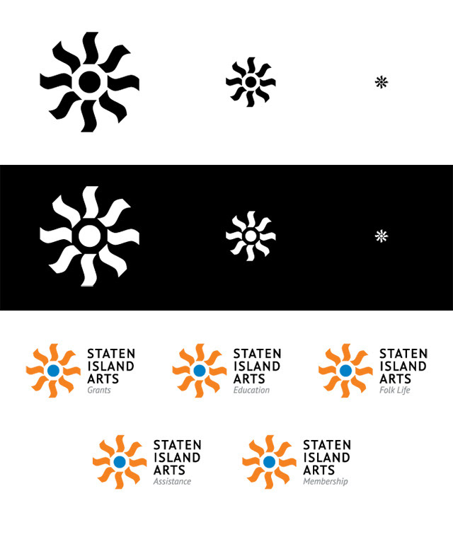
Logo functionality and brand divisions.
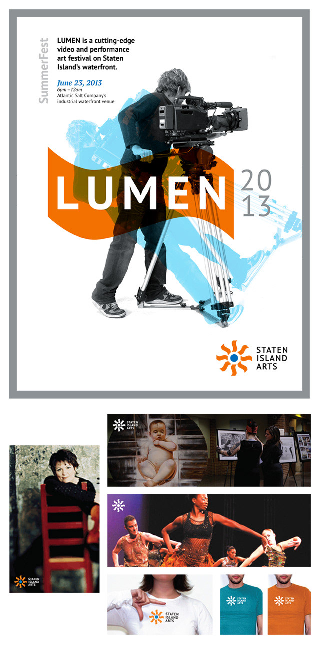
Application mock-ups.
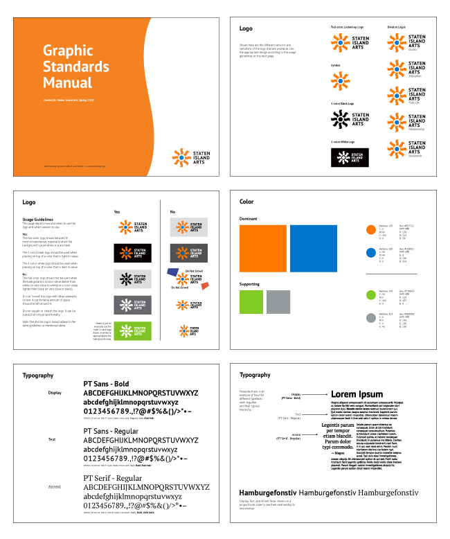
Brand guidelines.
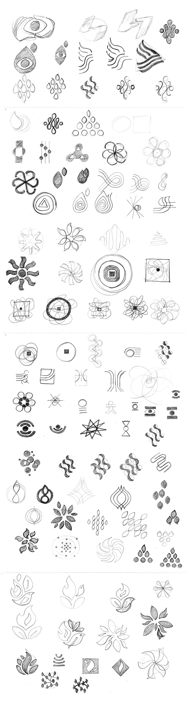
Sketches.