In the fall of 2014 the in-house team at HOW (a
publication for graphic designers) set out to redesign
the magazine and add new content. Working with our
editorial team, I led and executed the art direction
and design of the project. A few months later it was
complete and launched with the Spring 2015 issue.
The new direction leveraged color, geometric shapes,
iconography, and clean typography. The cover houses a
dedicated square container for art with cover lines
clearly placed in the masthead.
The brand "voice" for HOW is a blend of friendliness
with authority, and experienced "big-sibling", helpful
advice.
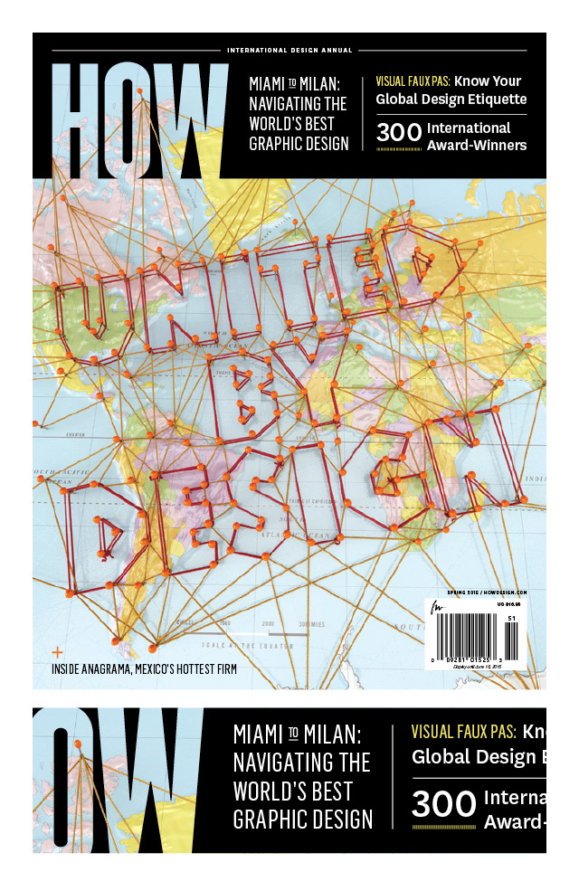
Cover and masthead.
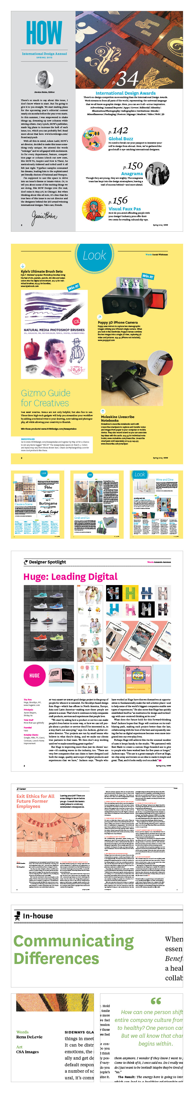
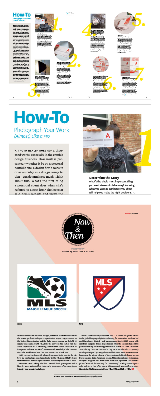
Columns and departments.
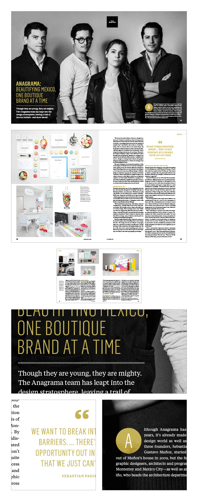
Feature example.
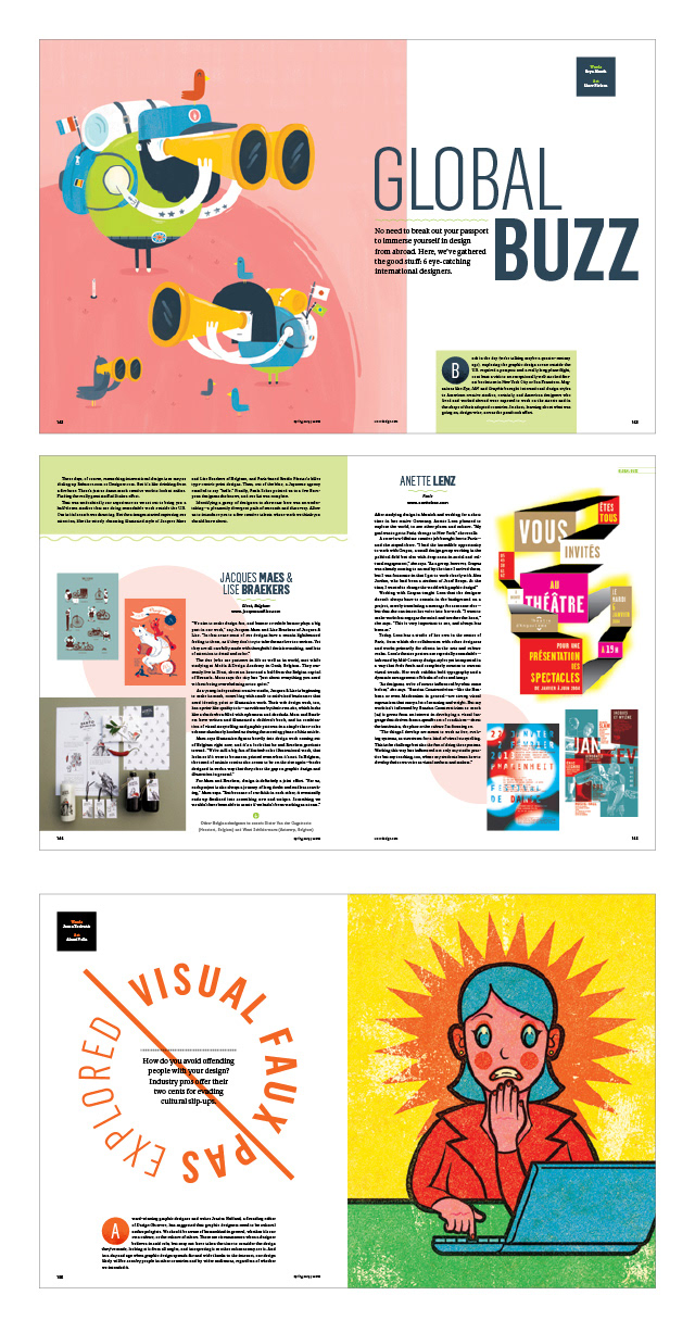
More feature examples.
New columns were added.
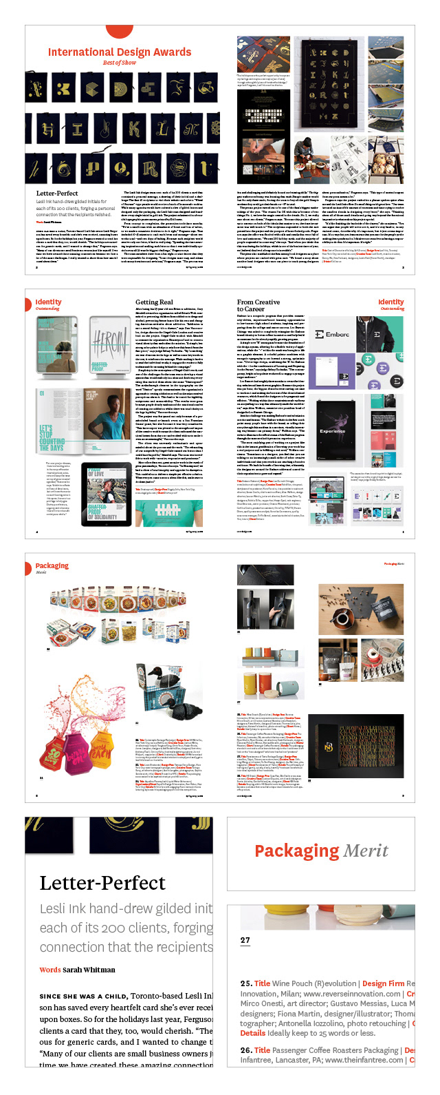
Competition section.
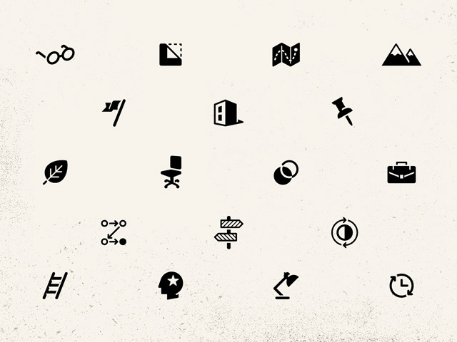
Icons to go with column names.
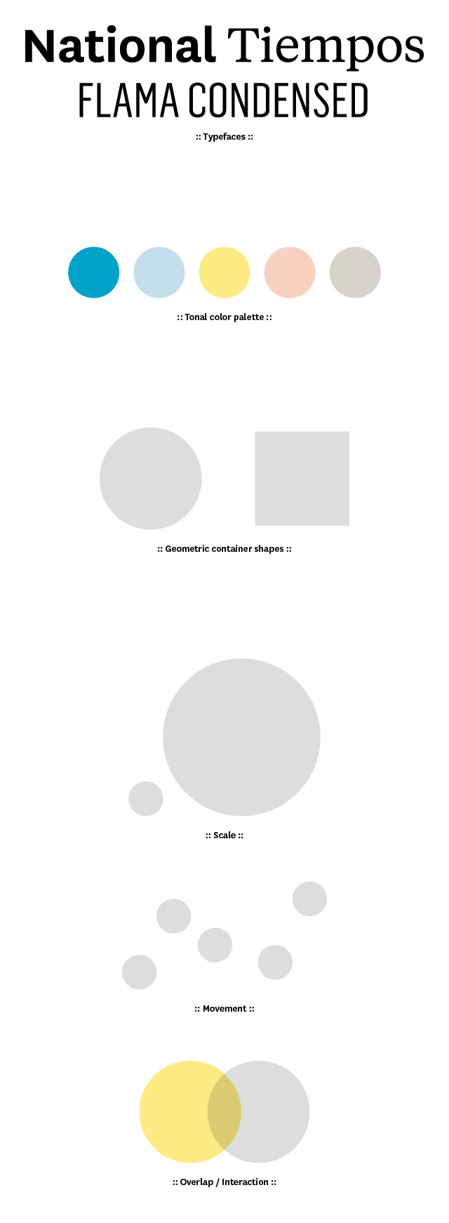
Redesign assets and principles.