Ads created for HOW magazine design competitions. The
concept was to give each unique competition some
personality and create an eye-catching, distinct look
and series to promote the competitions throughout the
year. The inspiration comes from 60's era children's
books.
The headlines were hand-drawn to mimic the textured
style in the illustrations. The type is New Century
Schoolbook (i really like the italic), as well as
Trade Gothic. A restrained and consistent color
palette was used for uniformity. The logo becomes a
badge of sorts and avoided overly cliché award
imagery.
Art direction/design: Adam Ladd
Illustrations: Brad Woodard
Illustrations: Brad Woodard
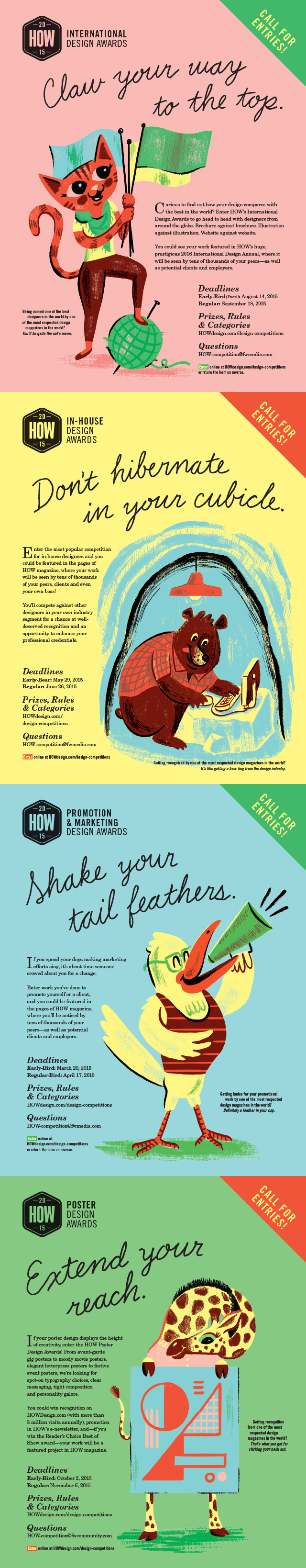
Magazine ads.
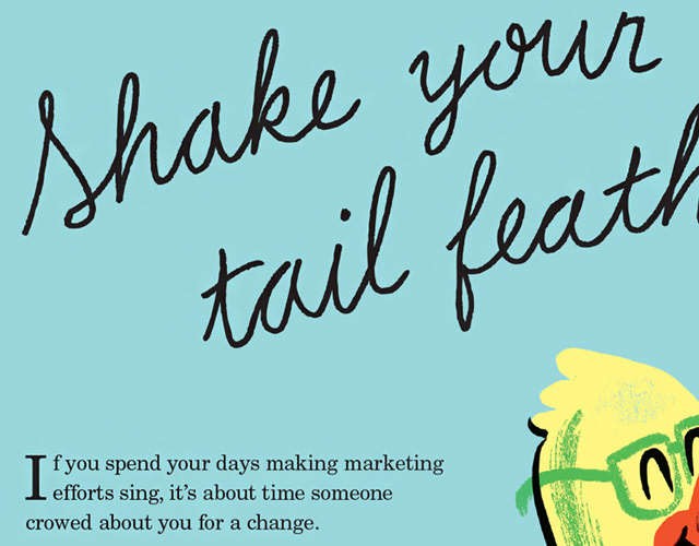
Detail of hand-drawn headlines and type.
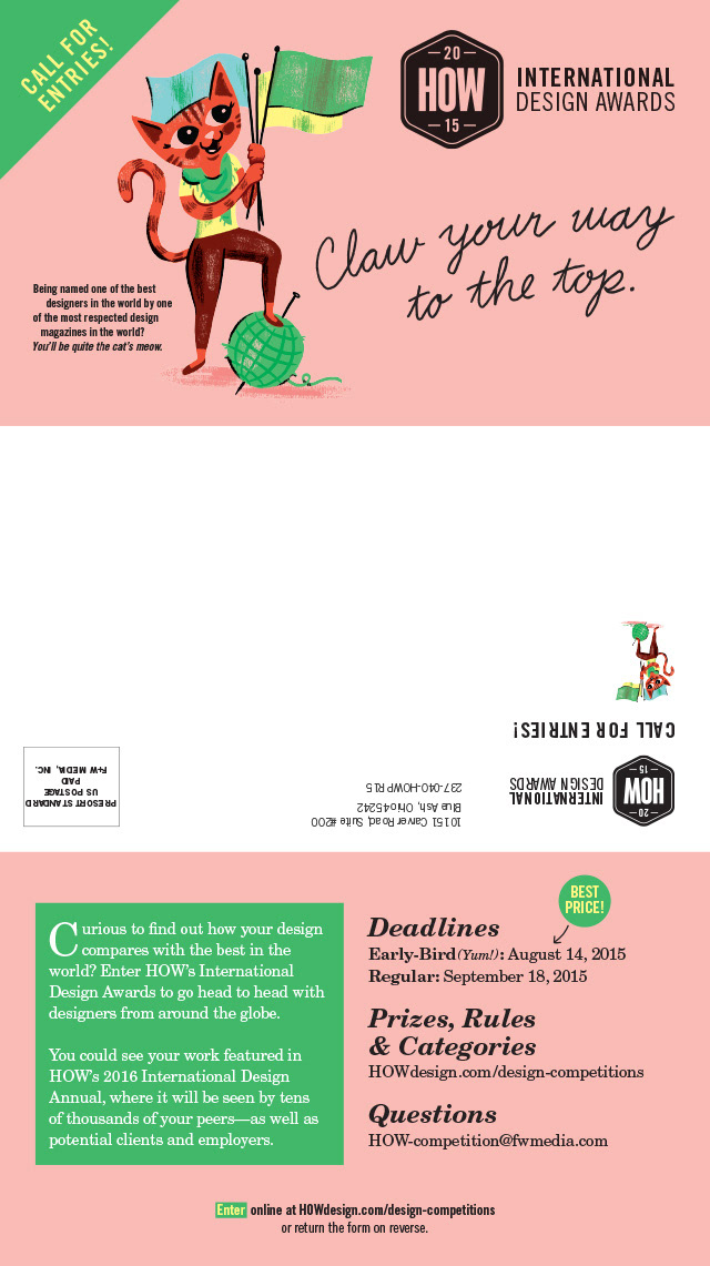
Folded mailer.
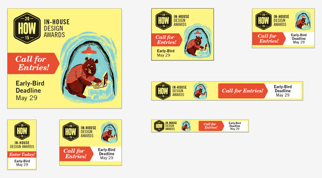
Website banner ads.